This page uses Pyodide. That means all the Python code you see here is
executed in your browser using WebAssembly. You can run the code
snippets by clicking the "Run Code" button. If you want to run all the
code snippets at once, click the "Run All" button.
Loading Python Console
“Human visual perception is the most powerful of data interfaces between
computers and Humans”
We have learned how to organise and analyse data and perform various statistical
operations on Pandas DataFrames. Likewise, in Class XI, we have learned how to
analyse numerical data using NumPy. The results obtained after analysis is used
to make inferences or draw conclusions about data as well as to make important
business decisions. Sometimes, it is not easy to infer by merely looking at the
results. In such cases, visualisation helps in better understanding of results
of the analysis.
Data visualisation means graphical or pictorial representation of the data using
graph, chart, etc. The purpose of plotting data is to visualise variation or
show relationships between variables.
Visualisation also helps to effectively communicate information to intended
users. Traffic symbols, ultrasound reports, Atlas book of maps, speedometer of a
vehicle, tuners of instruments are few examples of visualisation that we come
across in our daily lives.
Visualisation of data is effectively used in fields like health, finance,
science, mathematics, engineering, etc.
In this chapter, we will learn how to visualise data using Matplotlib library of
Python by plotting charts such as line, bar, scatter with respect to the various
types of data.
4.2 Plotting using Matplotlib
Matplotlib library is used for creating static, animated, and interactive
2D-plots or figures in Python. It can be installed using the following pip
command from the command prompt:
Terminal window
pipinstallmatplotlib
For plotting using Matplotlib, we need to import its Pyplot module using the
following command:
import matplotlib.pyplot as plt
import matplotlib.pyplot as plt
Here, plt is an alias or an alternative name for matplotlib.pyplot. We can use
any other alias also.
Figure 4.1: Components of a plot
The pyplot module of matplotlib contains a collection of functions that can be
used to work on a plot. The plot() function of the pyplot module is used to
create a figure. A figure is the overall window where the outputs of pyplot
functions are plotted. A figure contains a plotting area, legend, axis labels,
ticks, title, etc. (Figure 4.1). Each function makes some change
to a figure: example, creates a figure, creates a plotting area in a figure,
plots some lines in a plotting area, decorates the plot with labels, etc.
It is always expected that the data presented through charts easily understood.
Hence, while presenting data we should always give a chart title, label the axis
of the chart and provide legend in case we have more than one plotted data.
To plot x versus y, we can write plt.plot(x,y). The show() function is used
to display the figure created using the plot() function.
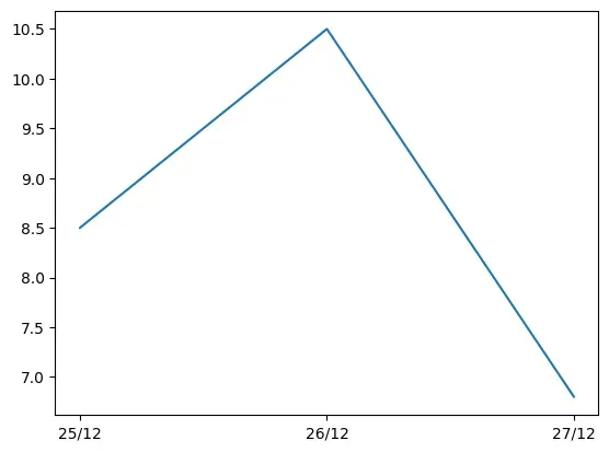
Let us consider that in a city, the maximum temperature of a day is recorded for
three consecutive days. Program 4-1 demonstrates how to plot
temperature values for the given dates. The output generated is a line chart.
Program 4-1
Plotting Temperature against Height
import matplotlib.pyplot as plt
# list storing date in string format
date =["25/12", "26/12", "27/12"]
# list storing temperature values
temp =[8.5, 10.5, 6.8]
# create a figure plotting temp versus date
plt.plot(date, temp)
# show the figure
plt.show()
import matplotlib.pyplot as plt
# list storing date in string format
date = ["25/12", "26/12", "27/12"]
# list storing temperature values
temp = [8.5, 10.5, 6.8]
# create a figure plotting temp versus date
plt.plot(date, temp)
# show the figure
plt.show()
Figure 4.2: Line chart as output of Program 4-1
In program 4-1, plot() is provided with two parameters, which
indicates values for x-axis and y-axis, respectively. The x and y ticks are
displayed accordingly. As shown in Figure 4.2, the plot()
function by default plots a line chart. We can click on the save button on the
output window and save the plot as an image. A figure can also be saved by using
savefig() function. The name of the figure is passed to the function as
parameter. For example:
plt.savefig('x.png')
In the previous example, we used plot() function to plot a line graph. There
are different types of data available for analysis. The plotting methods allow
for a handful of plot types other than the default line plot, as listed in
Table 4.1. Choice of plot is determined by the type of data we
have.
Table 4.1: List of Pyplot functions to plot different charts
plot(*args[, scalex, scaley, data])
Plot x versus y as lines and/or markers.
bar(x, height[, width, bottom, align, data])
Make a bar plot.
boxplot(x[, notch, sym, vert, whis, ...])
Make a box and whisker plot.
hist(x[, bins, range, density, weights, ...])
Plot a histogram.
pie(x[, explode, labels, colors, autopct, ...])
Plot a pie chart.
scatter(x, y[, s, c, marker, cmap, norm, ...])
A scatter plot of x versus y.
4.3 Customisation of Plots
Pyplot library gives us numerous functions, which can be used to customise
charts such as adding titles or legends. Some of the customisation options are
listed in Table 4.2:
Table 4.2: List of Pyplot functions to customise plots
grid([b, which, axis])
Configure the grid lines.
legend(*args, **kwargs)
Place a legend on the axes.
savefig(*args, **kwargs)
Save the current figure.
show(*args, **kw)
Display all figures.
title(label[, fontdict, loc, pad])
Set a title for the axes.
xlabel(xlabel[, fontdict, labelpad])
Set the label for the x-axis.
xticks([ticks, labels])
Get or set the current tick locations and labels of the x-axis.
ylabel(ylabel[, fontdict, labelpad])
Set the label for the y-axis.
yticks([ticks, labels])
Get or set the current tick locations and labels of the y-axis.
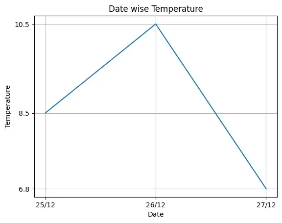
Program 4-2
Plotting a line chart of date versus temperature by adding Label on X and Y
axis, and adding a Title and Grids to the chart.
import matplotlib.pyplot as plt
date =["25/12", "26/12", "27/12"]
temp =[8.5, 10.5, 6.8]
plt.plot(date, temp)
plt.xlabel("Date") # add the Label on x-axis
plt.ylabel("Temperature") # add the Label on y-axis
plt.title("Date wise Temperature") # add the title to the chart
plt.grid(True) # add gridlines to the background
plt.yticks(temp)
plt.show()
import matplotlib.pyplot as plt
date = ["25/12", "26/12", "27/12"]
temp = [8.5, 10.5, 6.8]
plt.plot(date, temp)
plt.xlabel("Date") # add the Label on x-axis
plt.ylabel("Temperature") # add the Label on y-axis
plt.title("Date wise Temperature") # add the title to the chart
plt.grid(True) # add gridlines to the background
plt.yticks(temp)
plt.show()
Figure 4.3: Line chart as output of Program 4-2
In the above example, we have used the xlabel, ylabel, title and yticks
functions. We can see that compared to Figure 4.2, the
Figure 4.3 conveys more meaning, easily. We will learn about
customisation of other plots in later sections.
Think and Reflect
On providing a single list or array to the plot() function, can matplotlib
generate values for both the x and y axis?
4.3.1 Marker
We can make certain other changes to plots by passing various parameters to the
plot() function. In Figure 4.3, we plot temperatures day-wise.
It is also possible to specify each point in the line through a marker.
A marker is any symbol that represents a data value in a line chart or a scatter
plot. Table 4.3 shows a list of markers along with their
corresponding symbol and description. These markers can be used in program
codes:
Table 4.3: Some of the Matplotlib Markers
Marker
Symbol
Description
”.”
Point
”,“
Pixel
”o”
Circle
”v”
triangle_down
”^“
triangle_up
”<“
triangle_left
”>“
triangle_right
”1”
tri_down
”2”
tri_up
”3”
tri_left
”4”
tri_right
”8”
octagon
”s”
square
”p”
pentagon
”P”
plus (filled)
”*“
star
”h”
hexagon1
”H”
hexagon2
”+“
plus
”x”
x
”X”
x (filled)
“D”
diamond
4.3.2 Colour
It is also possible to format the plot further by changing the colour of the
plotted data. Table 4.4 shows the list of colours that are supported. We can
either use character codes or the color names as values to the parameter color
in the plot().
Table 4.4: Colour abbreviations for plotting
Character
Colour
’b’
blue
’g’
green
’r’
red
’c’
cyan
’m’
magenta
’y’
yellow
’k’
black
’w’
white
4.3.3 Linewidth and Line Style
The linewidth and linestyle property can be used to change the width and the
style of the line chart. Linewidth is specified in pixels. The default line
width is 1 pixel showing a thin line. Thus, a number greater than 1 will output
a thicker line depending on the value provided.
We can also set the line style of a line chart using the linestyle parameter. It
can take a string such as “solid”, “dotted”, “dashed” or “dashdot”. Let us write
the Program 4-3 applying some of the customisations.
Program 4-3
Consider the average heights and weights of persons aged 8 to 16 stored in the
following two lists:
plt.title("Average weight with respect to average height")
# plot using marker'-*' and line colour as green
plt.plot(
df.weight,
df.height,
marker="*",
markersize=10,
color="green",
linewidth=2,
linestyle="dashdot",
)
plt.show()
import matplotlib.pyplot as plt
import pandas as pd
height = [121.9, 124.5, 129.5, 134.6, 139.7, 147.3, 152.4, 157.5, 162.6]
weight = [19.7, 21.3, 23.5, 25.9, 28.5, 32.1, 35.7, 39.6, 43.2]
df = pd.DataFrame({"height": height, "weight": weight})
# Set xlabel for the plot
plt.xlabel("Weight in kg")
# Set ylabel for the plot
plt.ylabel("Height in cm")
# Set chart title:
plt.title("Average weight with respect to average height")
# plot using marker'-*' and line colour as green
plt.plot(
df.weight,
df.height,
marker="*",
markersize=10,
color="green",
linewidth=2,
linestyle="dashdot",
)
plt.show()
In the above we created the DataFrame using 2 lists, and in the plot function we
have passed the height and weight columns of the DataFrame. The output is shown
in Figure 4.4.
Figure 4.4: Line chart showing average weight against average height
4.4 the Pandas Plot functIon (Pandas VIsualIsatIon)
In Programs 4-1 and 4-2, we learnt that the plot() function of the pyplot
module of matplotlib can be used to plot a chart. However, starting from version
0.17.0, Pandas objects Series and DataFrame come equipped with their own
.plot() methods. This plot() method is just a simple wrapper around the
plot() function of pyplot.
Thus, if we have a Series or DataFrame type object (let’s say ‘s’ or ‘df’) we
can call the plot method by writing: s.plot() or df.plot()
The plot() method of Pandas accepts a considerable number of arguments that can
be used to plot a variety of graphs. It allows customising different plot types
by supplying the kind keyword arguments. The general syntax is:
plt.plot(kind), where kind accepts a string indicating the type of .plot, as
listed in Table 4.5. In addition, we can use the matplotlib.pyplot methods and
functions also along with the plt() method of Pandas objects.
Table 4.5: Arguments accepted by kind for different plots
kind
Plot type
line
Line plot (default)
bar
Vertical bar plot
barh
Horizontal bar plot
hist
Histogram
box
Boxplot
area
Area plot
pie
Pie plot
scatter
Scatter plot
In the previous chapters, we have learned to store different types of data in a
two dimensional format using DataFrame. In the subsequent sections we will learn
to use plot() function to create various types of charts with respect to the
type of data stored in DataFrames.
4.4.1 Plotting a Line chart
A line plot is a graph that shows the frequency of data along a number line. It
is used to show continuous dataset. A line plot is used to visualise growth or
decline in data over a time interval. We have already plotted line charts
through Programs 4-1 and 4-2. In this section, we will learn to plot a line
chart for data stored in a DataFrame.
Activity 4.1
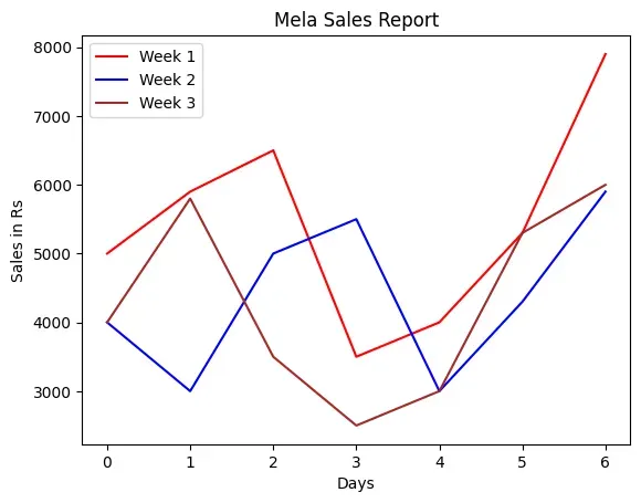
Create the MelaSale.csv using Python Pandas containing data as shown in Table 4.6.
Program 4-4
Smile NGO has participated in a three week cultural mela. Using Pandas, they
have stored the sales (in Rs) made day wise for every week in a CSV file named
“MelaSales.csv”, as shown in Table 4.6.
Table 4.6: Day-wise mela sales data
Week 1
Week 2
Week 3
5000
4000
4000
5900
3000
5800
6500
5000
3500
3500
5500
2500
4000
3000
3000
5300
4300
5300
7900
5900
6000
Depict the sales for the three weeks using a Line chart. It should have the
following:
i. Chart title as “Mela Sales Report”.
ii. axis label as Days.
iii. axis label as “Sales in Rs”.
Line colours are red for week 1, blue for week 2 and brown for week 3.
import pandas as pd
import matplotlib.pyplot as plt
# reads "MelaSales.csv" to df by giving path to the file
df = pd.read_csv("MelaSales.csv")
# create a line plot of different color for each week
df.plot(kind="line", color=["red", "blue", "brown"])
# Set title to "Mela Sales Report"
plt.title("Mela Sales Report")
# Label x axis as "Days"
plt.xlabel("Days")
# Label y axis as "Sales in Rs"
plt.ylabel("Sales in Rs")
# Display the figure
plt.show()
The Figure 4.5 displays a line plot as output for
Program 4-4. Note that the legend is displayed by default
associating the colours with the plotted data.
Figure 4.5: Line plot showing mela sales figures
The line plot takes a numeric value to display on the x axis and hence uses the
index (row labels) of the DataFrame in the above example. Thus, x tick values
are the index of the DataFramedf that contains data stored in MelaSales.CSV.
Customising Line Plot
We can substitute the ticks at x axis with a list of values of our choice by
using plt.xticks(ticks,label) where ticks is a list of locations(locs) on x axis
at which ticks should be placed, label is a list of items to place at the given
ticks.
Program 4-5
Assuming the same CSV file, i.e., MelaSales.csv, plot the line chart with
following customisations:
Maker = "*"
Marker size = 10
linestyle = "--"
Linewidth = 3
import pandas as pd
import matplotlib.pyplot as plt
df = pd.read_csv("MelaSales.csv")
# creates plot of different color for each week
df.plot(
kind="line",
color=["red", "blue", "brown"],
marker="*",
markersize=10,
linewidth=3,
linestyle="--",
)
plt.title("Mela Sales Report")
plt.xlabel("Days")
plt.ylabel("Sales in Rs")
# store converted index of DataFrame to a list
ticks = df.index.tolist()
# displays corresponding day on x axis
plt.xticks(ticks, df.Day)
plt.show()
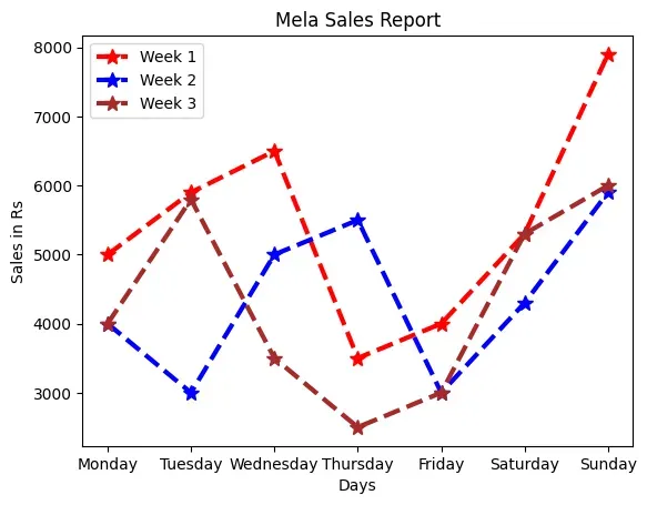
Figure 4.6: Line plot showing mela sales figures with day names
4.4.2 Plotting Bar Chart
The line plot in Figure 4.6 shows that the sales for all the weeks increased
during the weekend. Other than weekends, it also shows that the sales increased
on Wednesday for Week 1, on Thursday for Week 2 and on Tuesday for Week 3.
But, the lines are unable to efficiently depict comparison between the weeks for
which the sales data is plotted. In order to show comparisons, we prefer Bar
charts. Unlike line plots, bar charts can plot strings on the x axis. To plot a
bar chart, we will specify kind=‘bar’. We can also specify the DataFrame columns
to be used as x and y axes.
Let us now add a column “Days” consisting of day names to “MelaSales.csv” as
shown in Table 4.7.
Table 4.7: Day-wise sales data along with Day's names
Week 1
Week 2
Week 3
Day
5000
4000
4000
Monday
5900
3000
5800
Tuesday
6500
5000
3500
Wednesday
3500
5500
2500
Thursday
4000
3000
3000
Friday
5300
4300
5300
Saturday
7900
5900
6000
Sunday
Program 4-6
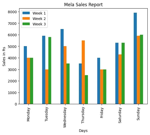
This program displays the Python script to display Bar plot for the
“MelaSales.csv” file with column Day on x axis as shown below in Figure 4.7
import pandas as pd
import matplotlib.pyplot as plt
df = pd.read_csv("MelaSales.csv")
# plots a bar chart with the column "Days" as x axis
import pandas as pd
import matplotlib.pyplot as plt
df = pd.read_csv("MelaSales.csv")
# plots a bar chart with the column "Days" as x axis
df.plot(kind="bar", x="Day", title="Mela Sales Report")
# set title and set ylabel
plt.ylabel("Sales in Rs")
plt.xlabel("Days")
plt.show()
Figure 4.7: A bar chart as output of Program 4-6
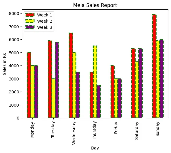
Customising Bar Chart
We can also customise the bar chart by adding certain parameters to the plot
function. We can control the edgecolor of the bar, linestyle and linewidth. We
can also control the color of the lines. The following example shows various
customisations on the bar chart of Figure 4.8
Program 4-7
Let us write a Python script to display Bar plot for the “MelaSales.csv” file
with column Day on x axis, and having the following customisation:
Changing the color of each bar to red, yellow and purple.
Edge Color to green
Linewidth as 2
Line style as --
import pandas as pd
import matplotlib.pyplot as plt
df = pd.read_csv("MelaSales.csv")
# plots a bar chart with the column "Days" as x axis
df.plot(
kind="bar",
x="Day",
title="Mela Sales Report",
color=["red", "yellow", "purple"],
edgecolor="Green",
linewidth=2,
linestyle="--",
)
# set title and set ylabel
plt.ylabel("Sales in Rs")
plt.show()
Figure 4.8: A bar chart as output of Program 4-7
Think and Reflect
How can we make the bar chart of Figure 4.8 horizontal?
4.4.3 Plotting Histogram
Histograms are column-charts, where each column represents a range of values,
and the height of a column corresponds to how many values are in that range.
To make a histogram, the data is sorted into “bins” and the number of data
points in each bin is counted. The height of each column in the histogram is
then proportional to the number of data points its bin contains.
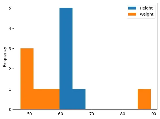
The df.plot(kind='hist') function automatically selects the size of the bins
based on the spread of values in the data.
The Program 4-8 displays the histogram corresponding to all
attributes having numeric values, i.e., ‘Height’ and ‘Weight’ attributes as
shown in Figure 4.9. On the basis of the height and weight values provided in
the DataFrame, the plot() calculated the bin values.
Figure 4.9: A histogram as output of Program 4-8
It is also possible to set value for the bins parameter, for example,
df.plot(kind="hist",bins=20)
df.plot(kind="hist",bins=[18, 19, 20, 21, 22])
df.plot(kind="hist",bins=range(18,25))
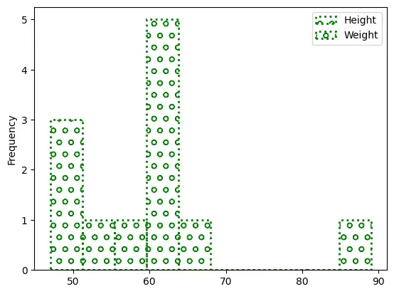
Customising Histogram
Taking the same data as above, now let see how the histogram can be customised.
Let us change the edgecolor, which is the border of each hist, to green. Also,
let us change the line style to ”:” and line width to 2. Let us try another
property called fill, which takes boolean values. The default True means each
hist will be filled with color and False means each hist will be empty. Another
property called hatch can be used to fill to each hist with pattern ( ‘-’, ‘+’,
‘x’, ‘\\’, ‘*’, ‘o’, ‘O’, ‘.’). In the Program 4-9, we have used
the hatch value as “o”.
Figure 4.10: Customised histogram as output of Program 4-9
Using Open Data
There are many websites that provide data freely for anyone to download and do
analysis, primarily for educational purposes. These are called Open Data as the
data source is open to the public. Availability of data for access and use
promotes further analysis and innovation. A lot of emphasis is being given to
open data to ensure transparency, accessibility and innovation. “Open Government
Data (OGD) Platform India” (data.gov.in) is a platform for supporting the Open
Data initiative of the Government of India. Large datasets on different projects
and parameters are available on the platform.
Let us consider a dataset called “Seasonal and Annual Min/Max Temp Series -
India from 1901 to 2017” from the URL
https://data.gov.in/resource/seasonal-and-annual-minmax-temp-series-india-1901-2017.
Our aim is to plot the minimum and maximum temperature and observe the number of
times (frequency) a particular temperature has occurred. We only need to extract
the ‘ANNUAL -MIN’ and ‘ANNUAL -MAX’ columns from the file. Also, let us aim to
display two Histogram plots:
# usecols parameter to extract only two required columns
data = pd.read_csv(
"Min_Max_Seasonal_IMD_2017.csv",
usecols=["ANNUAL - MIN", "ANNUAL - MAX"],
)
df = pd.DataFrame(data)
# plot histogram for 'ANNUAL - MIN'
df.plot(
kind="hist",
y="ANNUAL - MIN",
title="Annual Minimum Temperature (1901-2017)",
)
plt.xlabel("Temperature")
plt.ylabel("Number of times")
plt.show()
# plot histogram for both 'ANNUAL - MIN' and 'ANNUAL - MAX'
df.plot(
kind="hist",
title="Annual Min and Max Temperature (1901-2017)",
color=["blue", "red"],
)
plt.xlabel("Temperature")
plt.ylabel("Number of times")
plt.show()
import pandas as pd
import matplotlib.pyplot as plt
# read the CSV file with specified columns
# usecols parameter to extract only two required columns
data = pd.read_csv(
"Min_Max_Seasonal_IMD_2017.csv",
usecols=["ANNUAL - MIN", "ANNUAL - MAX"],
)
df = pd.DataFrame(data)
# plot histogram for 'ANNUAL - MIN'
df.plot(
kind="hist",
y="ANNUAL - MIN",
title="Annual Minimum Temperature (1901-2017)",
)
plt.xlabel("Temperature")
plt.ylabel("Number of times")
plt.show()
# plot histogram for both 'ANNUAL - MIN' and 'ANNUAL - MAX'
df.plot(
kind="hist",
title="Annual Min and Max Temperature (1901-2017)",
color=["blue", "red"],
)
plt.xlabel("Temperature")
plt.ylabel("Number of times")
plt.show()
Figure 4.11: Histogram for 'ANNUAL - MIN' and 'ANNUAL - MAX'
Figure 4.12: Histogram for 'ANNUAL - MIN'
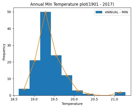
Program 4-11
Plot a frequency polygon for the ‘ANNUAL - MIN’ column of the “Min/Max Temp”
data over the histogram depicting it.
import numpy as np
import pandas as pd
import matplotlib.pyplot as plt
data = pd.read_csv(
"Min_Max_Seasonal_IMD_2017.csv",
usecols=["ANNUAL - MIN"],
)
df = pd.DataFrame(data)
# convert the 'ANNUAL - MIN' column into a numpy 1D array
minarray = np.array([df["ANNUAL - MIN"]])
# Extract y (frequency) and edges (bins)
y, edges = np.histogram(minarray)
# calculate the midpoint for each bar on the histogram
mid =0.5* (edges[1:] + edges[:-1])
df.plot(kind="hist",y="ANNUAL - MIN")
plt.plot(mid, y,"-^")
plt.title("Annual Min Temperature plot(1901 - 2017)")
plt.xlabel("Temperature")
plt.show()
import numpy as np
import pandas as pd
import matplotlib.pyplot as plt
data = pd.read_csv(
"Min_Max_Seasonal_IMD_2017.csv",
usecols=["ANNUAL - MIN"],
)
df = pd.DataFrame(data)
# convert the 'ANNUAL - MIN' column into a numpy 1D array
minarray = np.array([df["ANNUAL - MIN"]])
# Extract y (frequency) and edges (bins)
y, edges = np.histogram(minarray)
# calculate the midpoint for each bar on the histogram
mid = 0.5 * (edges[1:] + edges[:-1])
df.plot(kind="hist", y="ANNUAL - MIN")
plt.plot(mid, y, "-^")
plt.title("Annual Min Temperature plot(1901 - 2017)")
plt.xlabel("Temperature")
plt.show()
Figure 4.13: Output of Program 4-11
4.4.4 Plotting Scatter Chart
A scatter chart is a two-dimensional data visualisation method that uses dots to
represent the values obtained for two different variables —one plotted along the
x-axis and the other plotted along the y-axis. Scatter plots are used when you
want to show the relationship between two variables. Scatter plots are sometimes
called correlation plots because they show how two variables are correlated.
Additionally, the size, shape or color of the dot could represent a third (or
even fourth variable).
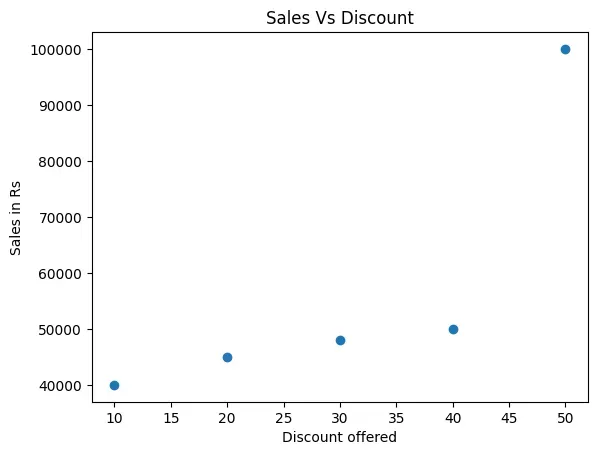
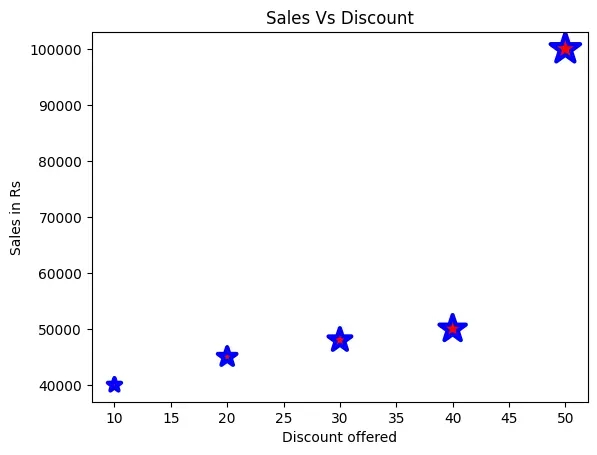
Program 4-12
Prayatna sells designer bags and wallets. During the sales season, he gave
discounts ranging from 10% to 50% over a period of 5 weeks. He recorded his
sales for each type of discount in an array. Draw a scatter plot to show a
relationship between the discount offered and sales made.
import numpy as np
import matplotlib.pyplot as plt
discount = np.array([10, 20, 30, 40, 50])
saleInRs = np.array([40000, 45000, 48000, 50000, 100000])
plt.scatter(x=discount, y=saleInRs)
plt.title("Sales Vs Discount")
plt.xlabel("Discount offered")
plt.ylabel("Sales in Rs")
plt.show()
Figure 4.14: Output of Program 4-12
Activity 4.2
What value does each bubble on the plot at Figure 4.14
represent?
Customising Scatter chart
The size of the bubble can also be used to reflect a value. For example, in
program 4-13, we have opted for displaying the size of the
bubble as 10 times the discount, as shown in Figure 4.15. The colour and markers
can also be changed in the above plot by adding the following statements:
Figure 4.15: Scatter plot based on modified Program 4-13
Think and Reflect
What would happen if we use df.plot(kind='scatter') instead of plt.scatter() in
Program 4-13?
4.4.5 Plotting Quartiles and Box plot
Suppose an entrance examination of 200 marks is conducted at the national level,
and Mahi has topped the exam by scoring 120 marks. The result shows 100
percentile against Mahi’s name, which means all the candidates excluding Mahi
have scored less than Mahi. To visualise this kind of data, we use quartiles.
Quartiles are the measures which divide the data into four equal parts, and each
part contains an equal number of observations. Calculating quartiles requires
calculation of median. Quartiles are often used in educational achievement data,
sales and survey data to divide populations into groups. For example, you can
use Quartile to find the top 25 percent of students in that examination.
A Box Plot is the visual representation of the statistical summary of a given
data set. The summary includes Minimum value, Quartile 1, Quartile 2, Median,
Quartile 4 and Maximum value. The whiskers are the two lines outside the box
that extend to the highest and lowest values. It also helps in identifying the
outliers. An outlier is an observation that is numerically distant from the rest
of the data, as shown in Figure 4.16:
Figure 4.16: A Box Plot
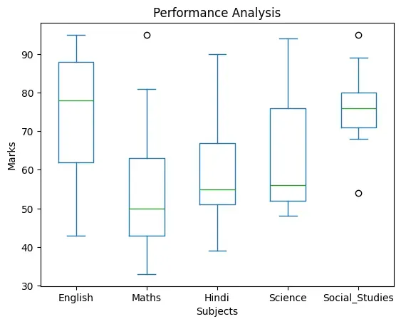
Program 4-14
In order to assess the performance of students of a class in the annual
examination, the class teacher stored marks of the students in all the 5
subjects in a CSV “Marks.csv” file as shown in Table 4.8. Plot the
data using boxplot and perform a comparative analysis of performance in each
subject.
Table 4.8: Marks obtained by students in five subjects
import numpy as np
import pandas as pd
import matplotlib.pyplot as plt
data = pd.read_csv("Marks.csv")
df = pd.DataFrame(data)
df.plot(kind="box")
# set title,xlabel,ylabel
plt.title("Performance Analysis")
plt.xlabel("Subjects")
plt.ylabel("Marks")
plt.show()
Figure 4.17: A boxplot of 'Marks.csv'
The distance between the box and lower or upper whiskers in some boxplots are
more, and in some less. Shorter distance indicates small variation in data, and
longer distance indicates spread in data to mean larger variation.
Think and Reflect
What would happen if the label or row index passed is not present in the
DataFrame?
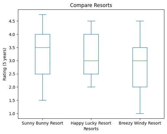
Program 4-15
To keep improving their services, XYZ group of hotels have asked all the three
hotels to get feedback form filled by their customers at the time of checkout.
After getting ratings on a scale of (1-5) on factors such as Food, Service,
Ambience, Activities, Distance from tourist spots they calculate the average
rating and store it in a CSV file. The data are given in Table 4.9.
Table 4.9: Year-wise average ratings on five parameters
Year
Sunny Bunny Resort
Happy Lucky Resort
Breezy Windy Resort
2014
4.75
3
4.5
2015
2.5
4
2
2016
3.5
2.5
3
2017
4
2
3.5
2018
1.5
4.5
1
This year, to award the best hotel they have decided to analyse the ratings of
the past 5 years for each of the hotels. Plot the data using Boxplot.
import pandas as pd
# Create a DataFrame from the given data
data = {
"Sunny Bunny Resort": [4.75, 2.5, 3.5, 4, 1.5],
"Happy Lucky Resort": [3, 4, 2.5, 2, 4.5],
"Breezy Windy Resort": [4.5, 2, 3, 3.5, 1],
}
df_resorts = pd.DataFrame(data)
# Save the DataFrame to a CSV file
df_resorts.to_csv("compareresort.csv", index=False)
import pandas as pd
import matplotlib.pyplot as plt
# read the CSV file in 'data'
data = pd.read_csv("compareresort.csv")
# convert 'data' into a DataFrame 'df'
df = pd.DataFrame(data)
# plot a box plot for the DataFrame 'df' with a title
df.plot(kind="box",title="Compare Resorts")
# set xlabel,ylabel
plt.xlabel("Resorts")
plt.ylabel("Rating (5 years)")
# display the plot
plt.show()
import pandas as pd
import matplotlib.pyplot as plt
# read the CSV file in 'data'
data = pd.read_csv("compareresort.csv")
# convert 'data' into a DataFrame 'df'
df = pd.DataFrame(data)
# plot a box plot for the DataFrame 'df' with a title
df.plot(kind="box", title="Compare Resorts")
# set xlabel,ylabel
plt.xlabel("Resorts")
plt.ylabel("Rating (5 years)")
# display the plot
plt.show()
Figure 4.18: A boxplot as output of Program 4.15
Think and Reflect
Which of the three resorts should be awarded? Give reasons.
Activity 4.3
Plot a pie to display the radius of the planets and also give an appropriate
title to the plot.
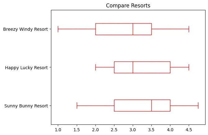
Customising Box plot
We can display the whisker in horizontal direction by adding a parameter
vert=False in the Program 4-15, as shown in the following line of code. We can
change the color of the whisker as well. The output of the modified Program is
shown in Figure 4.19.
Figure 4.19: The horizontal boxplot after modifying Program 4.15
4.4.6 Plotting Pie Chart
Pie is a type of graph in which a circle is divided into different sectors and
each sector represents a part of the whole. A pie plot is used to represent
numerical data proportionally. To plot a pie chart, either column label y or
‘subplots=True’ should be set while using df.plot(kind='pie'). If no column
reference is passed and subplots=True, a ‘pie’ plot is drawn for each numerical
column independently.
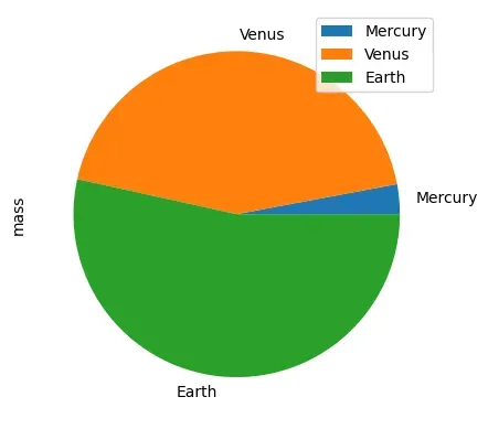
In the Program 4.16, we have a DataFrame with information about
the planet’s mass and radius. The ‘mass’ column is passed to the plot() function
to get a pie plot as shown in Figure 4.20.
It is important to note that the default label names are the index value of the
DataFrame. The labels as shown in Figure 4.20 are the names of
the planet which are the index values as shown in Program 4.16.
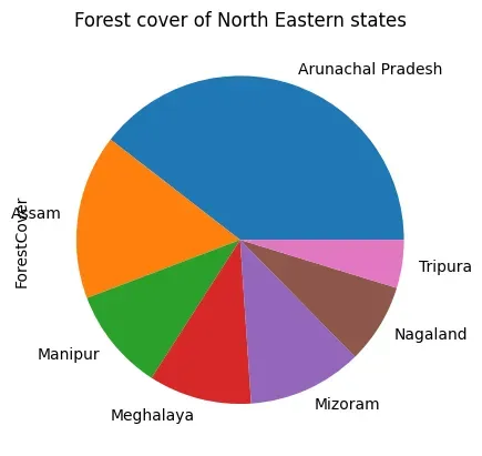
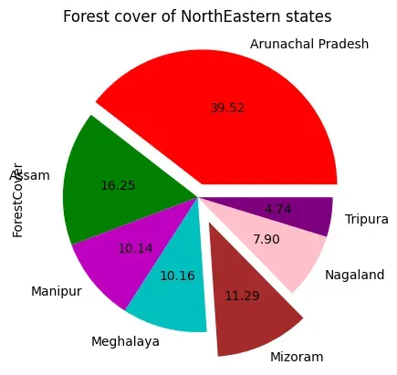
Program 4-17
Let us consider the dataset of Table 4.10 showing the forest
cover of north eastern states that contains geographical area and corresponding
forest cover in sq km along with the names of the corresponding states.
# explode the first wedge to .1 level and fifth to level 2.
c =["r", "g", "m", "c", "brown", "pink", "purple"]
# change the color of each wedge
df.plot(
kind="pie",
y="ForestCover",
title="Forest cover of NorthEastern states",
legend=False,
explode=exp,
autopct="%.2f",
colors=c,
)
plt.show()
import pandas as pd
import matplotlib.pyplot as plt
df = pd.DataFrame(
{
"GeoArea": [83743, 78438, 22327, 22429, 21081, 16579, 10486],
"ForestCover": [67353, 27692, 17280, 17321, 19240, 13464, 8073],
},
index=[
"Arunachal Pradesh",
"Assam",
"Manipur",
"Meghalaya",
"Mizoram",
"Nagaland",
"Tripura",
],
)
exp = [0.1, 0, 0, 0, 0.2, 0, 0]
# explode the first wedge to .1 level and fifth to level 2.
c = ["r", "g", "m", "c", "brown", "pink", "purple"]
# change the color of each wedge
df.plot(
kind="pie",
y="ForestCover",
title="Forest cover of NorthEastern states",
legend=False,
explode=exp,
autopct="%.2f",
colors=c,
)
plt.show()
Figure 4.22: Pie chart as output of Program 4-18
Summary
Exercise
Question 1
What is the purpose of the Matplotlib library?
Question 2
What are some of the major components of any graphs or plot?
Question 3
Name the function which is used to save the plot.
Question 4
Write short notes on different customisation options available with any plot.
Question 5
What is the purpose of a legend?
Question 6
Define Pandas visualisation.
Question 7
What is open data? Name any two websites from which we can download open data.
Question 8
Give an example of data comparison where we can use the scatter plot.
Question 9
Name the plot which displays the statistical summary. Note: Give appropriate
title, set xlabel and ylabel while attempting the following questions.
Question 10
Plot the following data using a line plot:
Day
Tickets sold
Monday
2000
Tuesday
2800
Wednesday
3000
Thursday
2500
Friday
2300
Saturday
2500
Sunday
1000
Before displaying the plot display “Monday, Tuesday, Wednesday, Thursday,
Friday, Saturday, Sunday” in place of Day 1, 2, 3, 4, 5, 6, 7
Change the color of the line to ‘Magenta’.
Question 11
Collect data about colleges in Delhi University or any other university of your
choice and number of courses they run for Science, Commerce and Humanities,
store it in a CSV file and present it using a bar plot.
Question 12
Collect and store data related to the screen time of students in your class
separately for boys and girls and present it using a boxplot.
Question 13
Explain the findings of the boxplot of Figure 4.18 by filling the following
blanks:
a) The median for the five subjects is _____ , ______, _______, ______, ______
b) The highest value for the five subjects is : _____ , ______, _______,
______, ______
c) The lowest value for the five subjects is : _____ , ______, _______,
______, ______
d) ______________ subject has two outliers with the value ________ and
e) ______________ subject shows minimum variation
Question 14
Collect the minimum and maximum temperature of your city for a month and present
it using a histogram plot.
Question 15
Conduct a class census by preparing a questionnaire. The questionnaire should
contain a minimum of five questions. Questions should relate to students, their
family members, their class performance, their health etc. Each student is
required to fill up the questionnaire. Compile the information in numerical
terms (in terms of percentage). Present the information through a bar,
scatter-diagram. (NCERT Geography class IX, Page 60)
Question 16
Visit data.gov.in , search for the following in “catalogs” option of the
website:
Final population Totals, India and states
State Wise literacy rate
Download them and create a CSV file containing population data and literacy rate
of the respective state. Also add a column Region to the CSV file that should
contain the values East, West, North and South. Plot a scatter plot for each
region where X axis should be population and Y axis should be Literacy rate.
Change the marker to a diamond and size as the square root of the literacy rate.
Group the data on the column region and display a bar chart depicting average
literacy rate for each region.